Dolphin HD Brings Versatility of Desktop Browsers to Android
A great thing about modern smartphones is that you don’t have to settle for pre-installed apps like we once had to on our old cellphones. This makes them much like PCs, where we could always hunt down for new programs to try out.
Your stock Android browser might be adequate, but there are better Android browsers out there, and Dolphin is one of them.
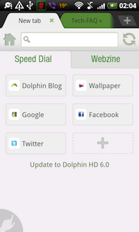
At first sight Dolphin reminds me a lot of Chrome on desktop computers, with its tabs and main toolbar looking very similar. There is even that recognizable plus button on the right which allows easily opening new tabs, and a small “x” button for closing them. The only thing you can’t do is arrange them by dragging and dropping, like in Chrome, as the horizontal swiping motion is reserved for scrolling through the open tabs. This makes it usable even in a portrait mode on a relatively cramped smartphone screen.
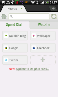
In Dolphin Settings, available from the menu, it is even possible to configure Dolphin to open links in new tab by default, and to open them in the background (without switching to them immediately). New tabs also have a “speed dial”, where you can add shortcuts to web sites you visit often.
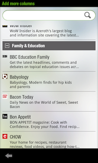
In Dolphin HD 6.0, which was released just recently, there is a second section on the new tab called “Webzine”, and it allows adding columns from about 150 categorized news sources. Clicking on one of the columns opens the selected news site in a nifty “magazine” view for easy flipping through and reading.
This view displays four titles per page with a short description in a distinctively magazine-like font, and of course the article image as well as a subtle color coding for each title. Instead of scrolling through the titles this view allows flipping through them both horizontally and vertically. The first of these four-title pages has an interesting green bar on top which says “drag to refresh” and points an arrow downward. In other words, refreshing the titles is a matter of dragging the page down.
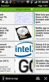
The bottom of the webzine view shows a button to bring up the tabs so you can switch to other tabs (which could have their own webzine views or standard sites loaded), and a close button that closes the webzine tab altogether.
I’m quite impressed with this, as it allows easy and clutter free browsing of latest news on a smartphone, pretty much removing any need for specialized news reader apps like Pulse. There’s just one complaint I have with regards to the list of news sources to add to a webzine column. The list is quite large, but there is no way to jump to a specific category, and has to be scrolled through each time. A simple category menu with sources listed within them instead of all on a single page might help here.
Another great feature of Dolphin is the toolbar, and perhaps the best thing about it is that it actually isn’t something that permanently takes up screen real estate once enabled, and isn’t even just a menu to be brought up at a click of some kind of a button. Instead it sits hidden on the right edge of the screen, and shows up with a swiping motion from that edge. The toolbar contains a full-screen button on top which hides the tabs and address bar, and a windows button on the bottom which shows all currently open tabs in a nice overlay view allowing you to close or zoom to either one.
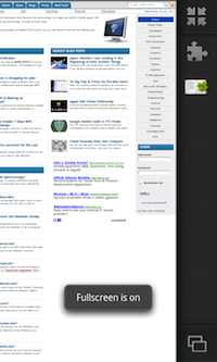
Most intriguingly, the toolbar reveals another great Dolphin feature with its Add Ons button. Yep, just like Chrome and Firefox on the desktop, Dolphin supports Add Ons, and there’s a number of them to choose from. Clicking the Add Ons button brings up a list of Add Ons, as well as Themes, and clicking on a download button lands you on an Android Market page from where the Add On or a Theme can be installed as if a normal Android app. Once installed, the Add On shows up as a new button on the toolbar!
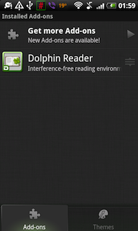
Speaking of themes, only four are listed so far for the HD version of dolphin; blue, purple, red and orange. Take your pick or stick with the default one, which still looks great.
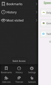
Moving to the left edge of the screen, we have something else “hiding”. A swipe from the left edge reveals a quick access pane with bookmarks, history and most visited sites. A quick access button further shows links to settings, add ons, themes and gestures. Besides the Quick Access button there is the Search button, and an Add Bookmark button (a star with a plus icon) which displays an Add Bookmark dialog. This dialog reminds a lot of what I’m used to seeing in Chrome and Firefox. You can set the bookmark name, adjust its URL, select which folder to put it in, and opt to put it in a speed dial on new tabs.
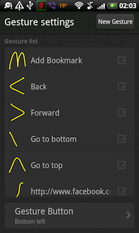
Gestures support is pretty well done as well. There is subtle round hand button in the bottom left corner which when clicked shows a darker overlay on which you can draw a gesture. Gestures can be viewed and configured from the Gestures screen linked to from the above mentioned Quick Access menu. Every gesture can be customized, and the gesture button can be put on either bottom left or bottom right, or it can be hidden altogether if you don’t want to use them.
I mentioned Dolphin settings above, but it is worth emphasizing just how much of it can be configured. Here is some of what you can set up in Dolphin:
- Dolphin’s User Agent
- Volume button behavior
- Prevent display from dimming when Dolphin is running
- Show a bookmarks bar on new tabs
- Save cache to an SD card
- Adjust text size and encoding
- Enable or disable javascript or plugins
- Enable browsing without history
- Some privacy and security settings (accept cookies, remember form data and passwords, enable location, show warnings)
- Set download directory
The whole browser can also be backed up and restored from an earlier back up, and bookmarks can be imported from another browser on the device.
All of this comes together to form a mobile browser that doesn’t seem to lack much of anything compared to its desktop counter parts, giving you the power and flexibility of a desktop browser on a mobile device such as a smartphone or a tablet. This might have many expect clutter or performance issues, but this doesn’t seem to be the case with Dolphin. Nothing gets in the way, but everything is at your finger tips.
Definitely worth a try if you own an Android smartphone or a tablet. You can download it at the Dolphin Browser web site.


Comments - No Responses to “Dolphin HD Brings Versatility of Desktop Browsers to Android”
Sorry but comments are closed at this time.