Ubuntu 11.04: Great Promise, Quirky Execution
The latest Ubuntu 11.04 Natty Narwhal is probably the most dramatic Ubuntu release to date, and the key to this is its new Unity default user interface. Unity marks several important shifts from Ubuntu. It is meant to serve as a single user interface for all form factors, from desktop PCs to netbooks and tablets (hence the name “Unity” for an unified experience across multiple devices). It marks a shift away from GNOME’s own desktop environment which it supported and bundled from the beginning.
Finally, it marks the start of Ubuntu’s new marketing strategy which pitches Ubuntu as a standalone operating system in its own right, not as just another Linux distribution, and positions other Canonical services around it (such as Ubuntu One).
In my opinion this is mostly good news. If it is to finally achieve mass appeal Ubuntu should differentiate itself from what Linux typically connotes, and present itself as an independent mature operating system, with a strong backer behind it, that can stand up to Windows and Mac OS X. It should not be bogged down by politics and attempts to please the vocal minority who believe they speak in the name of an entire “community” while often being mutually disagreeable themselves. Successful projects need a vision to stick with, not a committee that will vote on every single detail and then try to integrate the disparate results.
Good ideas that aren’t executed well, however, wont bear fruit, and this is what this review is about.
I’ve installed Ubuntu on two machines. The first is built around an old Core 2 Duo 1.83Ghz CPU, 3.5 GB of RAM, a single 640GB hard drive, and an Nvidia 9600GT video card serving two screens, one through a DVI port, and another through the VGA port.
The second machine contains a single-core Sempron CPU with 1GB RAM, 1TB hard drive and onboard Nvidia Graphics with a single screen.
Installation:
On first boot of its LiveCD Ubuntu 11.04 detects both of my screens fine, but duplicates the image and shows it in the same resolution on both screens, which is the resolution of the VGA connected screen.
I had some troubles getting the installer to load the LiveCD desktop instead of installing right away, as clicking the “Try Ubuntu” button hanged the installer until I forced it to quit by clicking the close button. The purpose of this was to take screenshots as I go along in case I want to use them for this review. Alas, this didn’t happen because, while the installation went smoothly, my video card overheated and screens shut off before it finished installing. After waiting for a bit, I did a box reset to reboot.
This is something that happens every time I touch an Ubuntu LiveCD, and has happened a few times before. I suspect that the default free video card driver used by this and last Ubuntu versions just doesn’t like this particular video card when used with two screens, and cannot manage the cooling of it properly. I’m still stumped as to what exactly the issue here is, but that it happens only in connection with Ubuntu isn’t promising.
Regardless, installation was successful, and I was able to boot into a fresh new Ubuntu install. To prevent more overheating, in case it is indeed caused by the default free video drivers, I promptly installed Nvidia’s proprietary drivers, and it has been behaving ever since.

Unity
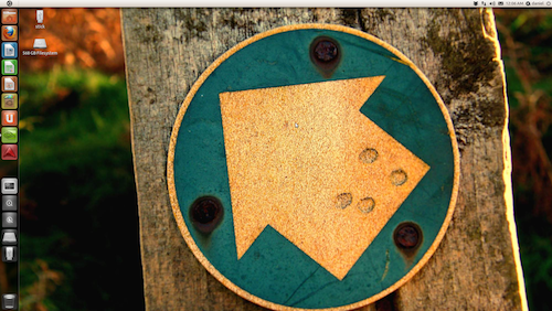
![]() I have to say that my first general impressions of Unity are mostly positive. As a heavy Mac user for the past year I like the many ideas that it borrows from it. The things that I like about it the most is the ability to easily save screen real estate. Maximizing windows just about makes them full screen, with all elements but the thin top panel gone, but still quickly accessible. This reminds me somewhat of the upcoming full-screen apps feature in the new Mac OS X Lion.
I have to say that my first general impressions of Unity are mostly positive. As a heavy Mac user for the past year I like the many ideas that it borrows from it. The things that I like about it the most is the ability to easily save screen real estate. Maximizing windows just about makes them full screen, with all elements but the thin top panel gone, but still quickly accessible. This reminds me somewhat of the upcoming full-screen apps feature in the new Mac OS X Lion.
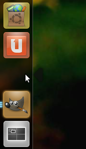
The launcher is visually appealing, and I like the way it marks running applications with the left arrow and an active application with the right arrow, but I somewhat miss the ability to resize the launcher as a whole, and a way to rearrange items on it takes some getting used to. Intuitively I just grab an item and drag it across the launcher to put it in a different spot, but Unity’s launcher requires me to pull it to the right side and then drop it to the spot where I want it.
 One thing that I noticed on both computers I tested on is that after adding an application to the launcher its icon is missing, leaving a blank spot on the launcher, which both looks ugly and fails to communicate what the application is. This is one among a number of things which qualify the “quirky” label I give to Ubuntu 11.04.
The dash, the thing that pops out when I click on the Ubuntu logo on the top-right (quite reminiscent of the Apple logo in Mac OS X) is also quite visually appealing, but seems to need some getting used to. The search itself is great, and I love how it displays both installed apps and those easily available for download. What bothers me slightly is that after clicking on a lens there doesn’t seem to be a way to go back other than closing the dash and opening it again. Instead we are given an application category menu on the right side. This is another case of Unity failing to meet an intuitive expectation.
Finally, there is the top panel the right side of which isn’t dramatically different from what it was in past releases. Speaking of which, there is one little feature that I liked, but is missing in 11.04, the ability to set multiple locations in the Time & Date widget and have them show in a little map of the world along with what’s the time in those locations.
When windows are maximized the panel simultaneously acts as its title bar and the corresponding application’s menu bar. The behavior of the application menu is puzzling though. It is hidden unless I mouse over that area of the panel, and when it shows it overlaps with the application title instead of displaying next to it. I suppose it does this to save horizontal space on devices with smaller screens, but it’s hard to imagine an application title so long that it would so significantly push the application menu to the right. The hiding of the application menu, however, I cannot explain as anything other than an attempt to make Unity look initially as minimalistic and “clean” as possible and perhaps avoid looking too much like OSX (and I think it’s too late for that anyway).
Stability and Performance
Most of the Unity’s usability quirks might be forgivable if the system as a whole felt rock solid and snappy, but unfortunately I cannot claim to have experienced this, even on my relatively fast machine. I suppose this is a case of “death by the thousand papercuts”, at the very least. Moving windows feels a little sluggish, the responsiveness of the interface seems slightly lacking, and launching certain applications (like settings managers) sometimes takes longer than I’d expect them to be.
I don’t want to chalk up the blame for this on my video card or the fact that this is a dual-screen set up, since Windows 7 seems to be handling that quite fine, and Nvidia 9600GT video card, capable of playing some High Definition video games, should hardly have a problem with a 3D accelerated user interface. Perhaps the proprietary Nvidia drivers aren’t so good, but last time I checked they were typically praised for their Linux driver quality, and the free driver seems to be even worse. In fact, I don’t think it is capable of running Unity at all.
Stability-wise, on a Sempron machine we’ve experienced a number of oddities, from applications failing to launch minutes after the launch was initiated to windows completely losing their Unity styling and exposing that dreadful Windows 95-like GNOME look.
Here’s a good example of how wrong things can go with Ubuntu 11.04. At install time I apparently selected the wrong keyboard layout variant, so once we noticed our keys not typing what they should be typing I went to keyboard preferenes and added a new layout and deleted the current one. I applied settings, and everything was great, until we rebooted. Upon reboot, it was still set to the wrong keyboard layout, the one that was supposed to be deleted from settings. It would seem, at that point, that each time we boot into Ubuntu we would have to manually select the right keyboard layout just because we were silly enough to make an innocuous mistake during installation-time.
The Sempron computer is owned by my sister, and she is what you would call an end-user, somewhat tech-savvy, but still not up for tinkering and tweaking or waiting for the system to get its act together. She represents the “ordinary user” that Ubuntu is supposedly aiming for, and to say she wasn’t happy would be an understatement.
The best thing about Ubuntu 11.04 in terms of performance and stability is its boot time. It is nothing short of impressive. It is unfortunate that it tends to make up for that by performing less than admirably after the boot.
Configurability
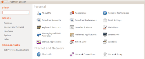
Believe it or not Ubuntu 11.04 still has a control center rich with various managers to configure various facets of the system, but it isn’t immediately visible anywhere. You have to search for “settings” or “control” before it appears. This seems to be a fairly clear signal that Ubuntu is targeting people who don’t want to tinker much.

Still this does mean you can adjust such things as preferred applications, startup applications,, personal file sharing, printing and so on, but given the above experiences I am not entirely confident that all of it will go smoothly.
Conclusion
Canonical has big dreams for Ubuntu, and shows a lot of promise, but it still has trouble with the execution. As much as they might want to differentiate Ubuntu from a typical Linux distribution, as of 11.04, it still sits squarely within the standard Linux stereotype, and it can be described almost exactly as “promising, but quirky”, or in other words “a constant work in progress”. We are treated with some great ideas and innovation, and fancy new features, but by the time they are smoothened out and executed properly (if ever) Windows and Mac OS X not only catch up, but wipe the floor with their equivalents. Why does this happen over and over again is a subject for another discussion, but it seems to be a recurring phenomenon.
It has been my experience for a number of years now for a new Ubuntu release to show lots of promise, and then disappoint. It always looks and feels great, but try and push it across a few delicate limits and it will show its real quirky face, and sometimes it doesn’t even need a push.
Why be so harsh? It’s simple. Windows and Mac OS X aren’t sitting idle either, and are in a far better position than any Linux or Ubuntu itself ever was. Ubuntu simply has to do far better than this to be truly competitive.


Comments - 7 Responses to “Ubuntu 11.04: Great Promise, Quirky Execution”
Sorry but comments are closed at this time.