Ubuntu 12.04: Less Quirky

Linux and quirkiness tend to be synonymous, if looked from the perspective of a user who doesn’t want to fiddle or deal with workarounds to make things work smoothly. Release after release Ubuntu has been no different in this department, even when it seemed closest to the goal of a perfectly user-friendly system. It’s become somewhat of a running joke among some circles to go test out the shiny new hyped Ubuntu thinking this is finally it, and they’ve finally done it, and then leave with a bit of a disappointment. This has been going on for years.
If this seems like it is an overly high standard to judge it by it isn’t. If there’s gonna be any point to even reviewing Ubuntu we need to think of the competition, and the competition is tough. Both Windows 7 and Mac OS X are smooth, professional, mature operating systems that should leave most users expecting a lot in terms of stability, polish, ease of use, and functionality.
That said, Ubuntu 12.04 is at the very least among the best Ubuntu releases so far, and definitely represents an improvement over 11.10. For users of the old version I can immediately recommend an upgrade.
What’s Improved
- Launcher supports changing the icon size, and progress bar on the icons of programs being installed.
- Dash video search lens
- Tinting Launcher, Dash, and notifications based on dominant color of the desktop background.
- The HUD interface for controlling various application functions through searches and commands.
- New login screen that shows the wallpaper of selected user.
- Better performance
- More power efficient
- Better dual monitoring support.
Unity
The Launcher, Dash, and the HUD are all part of the Unity User Interface that is now a part of Ubuntu’s identity. The switch to Unity was a controversial move, and remains so, partly because of the new paradigms it introduced, partly because of initial bugginess, and partly because of the lack of flexibility. In various ways Apple’s Mac OS X user interface is more flexible and lends itself to greater user customization than Unity, ironic given Apple’s reputation for limiting customizability in favor of pre-selected and pre-approved defaults.
Launcher
Ubuntu 12.04 still remains a bit stuck up in that sense. For example, the Launcher still cannot be moved to other edges of the screen. The good news is that you can change its size now by changing the icon size of Launcher icons. This means you can make it take less horizontal screen real estate, and fit more icons to it without having to scroll.
![]()
When installing applications using the Ubuntu Software Center the Launcher also shows a progress bar after which the app icon wiggles to indicate that it is now installed. This is a far cry from previous behavior where you had to search for a newly installed app and add it to the Launcher manually if you wanted it. It easier to remove the icon from the Launcher if you don’t want it there than searching for and adding it if you do.
![]()
Another good news is that the Launcher now shows on all screens if you have multiple screens connected to your computer, but this option is configurable under Display settings.
Dash
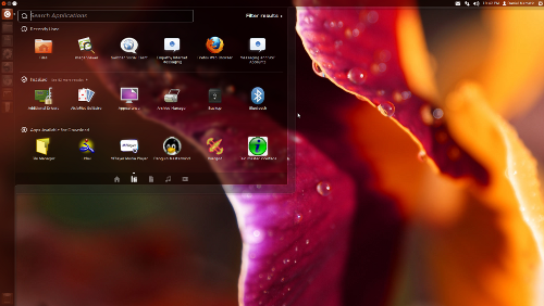
Dash search has become even more versatile with the addition of a video search lens that allows searching for videos from a whole of 14 sources. The results filter can be used to limit search only to some sources as well. In addition to videos, Dash can also search for applications, files and folders, and music.
Another nice touch is the color tinting of Dash, Launcher and notifications to match the dominant color of the desktop wallpaper. If your wallpaper is mostly green they will have a greenish tint, making it fit better to your desktop. It means that when you are changing your desktop wallpaper you are automatically also customizing the color of these Unity elements. It would, however, be nice if it was possible to turn this off and use a specific custom color instead, like in Windows 7.
Remaining Quirks
Overall, Unity feels smoother, and these additions make it a little more powerful. However, some of the earlier quirks remain. Hiding application menus unless you hover over the top bar is still disliked by some, and is arguably unnecessary. However, Ubuntu 12.04 at least shows them for a few seconds before hiding them, giving at least some chance for the user to notice that they are there.
The close/minimize/maximize buttons are also hidden unless top bar is hovered, which might confuse some of the newcomers from Windows whom are used to these being on the right as opposed to the left as on Ubuntu. It even confuses me a little despite using a Mac where they are on the same size, probably because I’m used to them being there. To some extent it seems maximized windows in Ubuntu act like full-screen apps on Mac, except the Launcher is still visible and the user doesn’t quite expect for these buttons to get hidden.
Also, the menu items when shown still cover the application title. This too seems unnecessary when there is plenty of space to the right. Perhaps this will improve in future releases, or perhaps this is just the way Ubuntu developers have decided this should work. We shall see. They are admittedly relatively minor complaints.
Themes
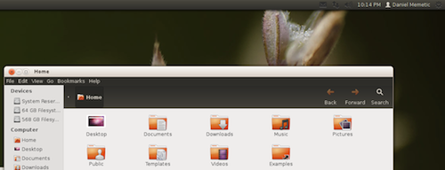
A quirk that seems to be new is some bugginess with the built-in alternative Radiance theme. Nautilus windows don’t seem to change their color properly, leaving a glaring dark area below the titlebar as seen in the picture. The top bar background color also doesn’t change to the light one the way it should, making the icons in the system tray on the right less visible.

Speaking of themes, I was wondering if I could easily install additional themes for Unity. I saw the “Themes & Tweaks” category in the Ubuntu Software Center, but it mainly contains utilities for various tasks. Searching for Unity themes online brings up various disparate sources, and installing any of them typically requires adding a repository via command line, and installing from there, or installing some dependencies and moving the theme’s folder to a specific location. In short, it’s not quite a user-friendly experience, not by today’s standards. In other words, most people will probably just stick with the defaults.
Note that it actually used to be easier. When Ubuntu was still using GNOME as it’s desktop environment installing a new theme was often a matter of downloading a compressed archive and drag’n dropping it into an Appearance window.
HUD
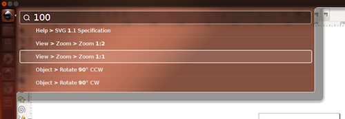
When I hear the word “HUD” I tend to think of video games with the HUD displaying various information about the player and his surroundings. HUD of course stands for “Heads Up Display”, and in Ubuntu it’s actually a kind of command search and execution interface. Just pressing the alt key brings it up, and when you start typing it displays some matching commands that you might want to execute, which correlate to the application’s menu item paths.
HUD will only look for menu items within the currently active application, and as such it basically acts as a replacement of menus. Perhaps this is why Ubuntu developers hide the menus. They want to nudge people to use HUD instead.

As you can see from the screenshot it is a bit intelligent about predicting what you might want to do. I simply typed “100” hoping to get an option to resize the canvas to 1:1 size, and it offered resizing options.
I will admit that some things might actually be faster to do by bringing up the HUD and finding the action there than by browsing through menus. However, the disadvantage is that you have to know of the command you want to execute (similar complaint can be made about Dash). Browsing menus is the easiest way to figure out what commands are available to begin with.
Applications
I actually feel this part of the review to be less and less relevant or interesting. The way Ubuntu is set up now combined with almost ubiquitous broadband access means that the line between included applications and those few clicks away from being installed is somewhat blurred. Dash shows both installed applications and those that can be installed quickly and easily so, in some sense, everything in the Ubuntu Software Center is “included” with Ubuntu.
That said, what we do get by default includes all of the basic utilities that we should expect with any modern OS nowadays, such as the Archiver Utility, PDF viewer, Movie Player, Shotwell Photo Manager (nice and simple), Rhythmbox Music Player, Brasero Disc Burner, and of course, the Firefox web browser, and the Thunderbird email client.
As is traditional with Ubuntu there is also an entire office suite included, namely LibreOffice. Another notable addition, debuted in a previous version, is the backups utility.
For instant messaging Empathy is still there with its support for many instant messaging protocols. Gwibber is still included for social networking as a client to Twitter, Facebook, and Identi.ca.
Performance
Ubuntu 12.04 performs quite adequately in terms of responsiveness, and perhaps slightly better than the last version. It’s not without quirks though, as certain drop down menus (such as the theme switcher menu in Appearance settings or the menus for selecting a protocol in Empathy) seem to load a bit sluggishly. This hints at a somewhat inconsistent experience performance-wise. Overall I wouldn’t say I felt a very notable difference.
Dual Monitoring
One of the things improved in Ubuntu 12.04 is support for multiple monitors, but it still seems a bit quirky. Suffice it to say that I’ve had to use Nvidia X Server Settings utility to set it up right, because Ubuntu’s Display settings didn’t quite do the job. In fact it sees the entire screen as a single big screen called “Laptop” (despite this being a PC with one standard LCD monitor, and one TV). Perhaps it is confused because I have the TV connected to a DVI port via a DVI-HDMI adapter.
Still, the launcher showing on both screens, and no further quirkiness in their operation in Ubuntu is good to see. Things were worse before.
Conclusion
Ubuntu 12.04 feels like a step in the right direction for Ubuntu, at least within the confines of the path they’ve chosen with Unity. It’s obviously here to stay so what counts is making it better by making it more flexible, more polished, and easier and quicker to use.
It is still incrementalism in action, however. There is nothing particularly revolutionary here. The closest thing that comes to “revolutionary” is the HUD, but I can’t say I’m that enthusiastic about it at this point. Other than a few added features, in terms of overall polish, usability, performance, and usability the best descriptor I can find is that it’s “less quirky”.
As an OS in its own right, however, it is not hard to recommend it to those who like its style and idiosyncracies. I’d mention the fact that it is free as a big selling point, but that applies to all other Linux distributions. Would I recommend it to someone who currently uses only Windows or Mac OS X? That depends on how, if at all, eager that someone might be to try something else.
Perhaps the best target market might be intermediary-to-advanced computer users who want a Mac OS X -ish experience without actually shelling out for Apple hardware. This might be as OSX-like as it gets, but done in its own peculiar way, and with a little more quirkiness included.


Comments - 7 Responses to “Ubuntu 12.04: Less Quirky”
Sorry but comments are closed at this time.