Purple Theme Navigation System
Preview:
Purple Theme Navigation System. 
Step one:
Open a new document. For this tutorial, I am just going to use a 800×140 px (Width, Height) document with a white background. First create a new layer set called Button, Layer > New > Layer Set. Then in a new layer draw a #7E00FF colored rectangle, size 160×25 px. 
Step two:
With your step one layer add the following layer styles: 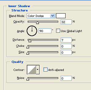
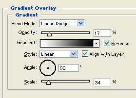
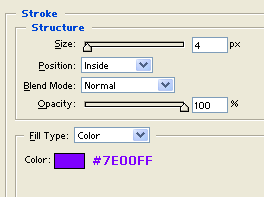

Step three:
Make another layer and draw a white rectangle on the left side with a little space from the edge of your purple rectangle. The size of this white rectangle is 19×16 px. 
Step four:
With your step three layer add the following layer styles and set the blending mode to Darken: 


Step five:
Now duplicate your small rectangle layer from step three and position this copy on the other end. 
Step six:
Create a new layer then draw a 4 px white line just below your purple rectangle. 
Step seven:
With your step five layer add a Drop Shadow layer style and set the blending mode to Darken: 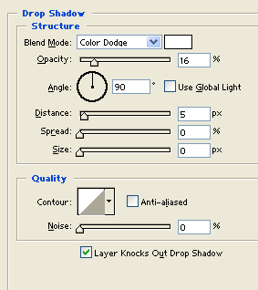

Step eight:
Now duplicate your Tab layer set and set them up side by side, in this tutorial we have 4 navigation links so we duplicated the Tab layer set 3 times. 
Step nine:
Add your navigation links on the center of each tab using font Verdana, bold, 12 pt, crisp and white for color. 
Step ten:
Now add a large #0000FF colored rectangle right above your tabs. 
Step eleven:
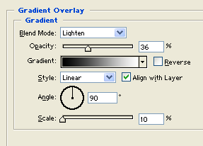
With your step three layer add the following layer styles and your done. 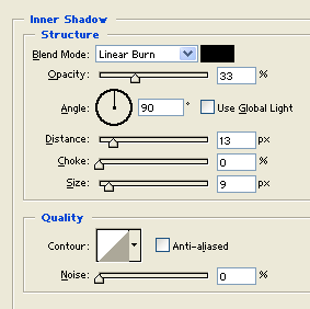


Comments - No Responses to “Purple Theme Navigation System”
Sorry but comments are closed at this time.